 Grid Theme Colors
React Data Grid
deebo-grid/src/DeeboDataGrid.jsx
This file handles many important functions that power the data grid, including initialization. Do a search for
buildInitUiDataTable . It accepts 3 arguments, but you can get the default functionality by only passing the 1st argument, which is your data.
The 2nd and 3rd arguments are for the color scheme you want to apply to the grid. The args accept any css color or hex code.
Do a ctrl + F in the file of interest for handleTheme( to find the jsx function that
applies the theme colors. The first color value you pass (2nd arg in buildInitUiDataTable) will mainly determine text colors.
The 2nd color value you pass (3rd arg in buildInitUiDataTable) will mainly determine some background colors and borders. There
are essentially an unlimited amount of theme combinations you can create with just 2 colors. Pass null for either arg to use only
1 theme color at a time. Or only pass a 2nd arg. Pass null for both or only pass your dataset to buildInitUiDataTable to use the
default theme.
buildInitUiDataTable(tdata, "#000035", "#e9e9e9")//hex or rgb values work best
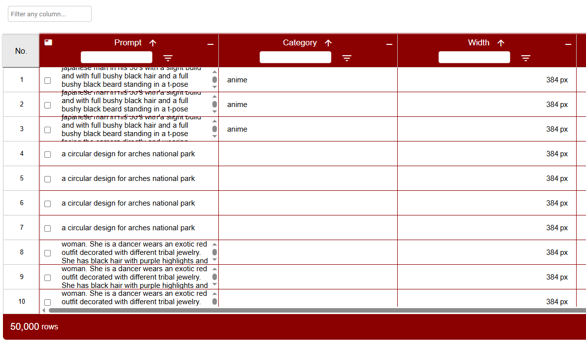
An invocation of buildInitUiDataTable with the theme colors "white" and "darkred" as the 2nd and 3rd arguments, respectively would result in the following grid appearance: